PROJECTS
Where Craft Meets Concept. One of a Type
Where Craft Meets Concept. One of a Type
Where Craft Meets Concept. One of a Type
Workflow
Introduction
Design Process
Applications
Outcome
TEAM
Mónica Ferraz
TIME
2014/2015
PRODUCT
One of a Type
Introduction
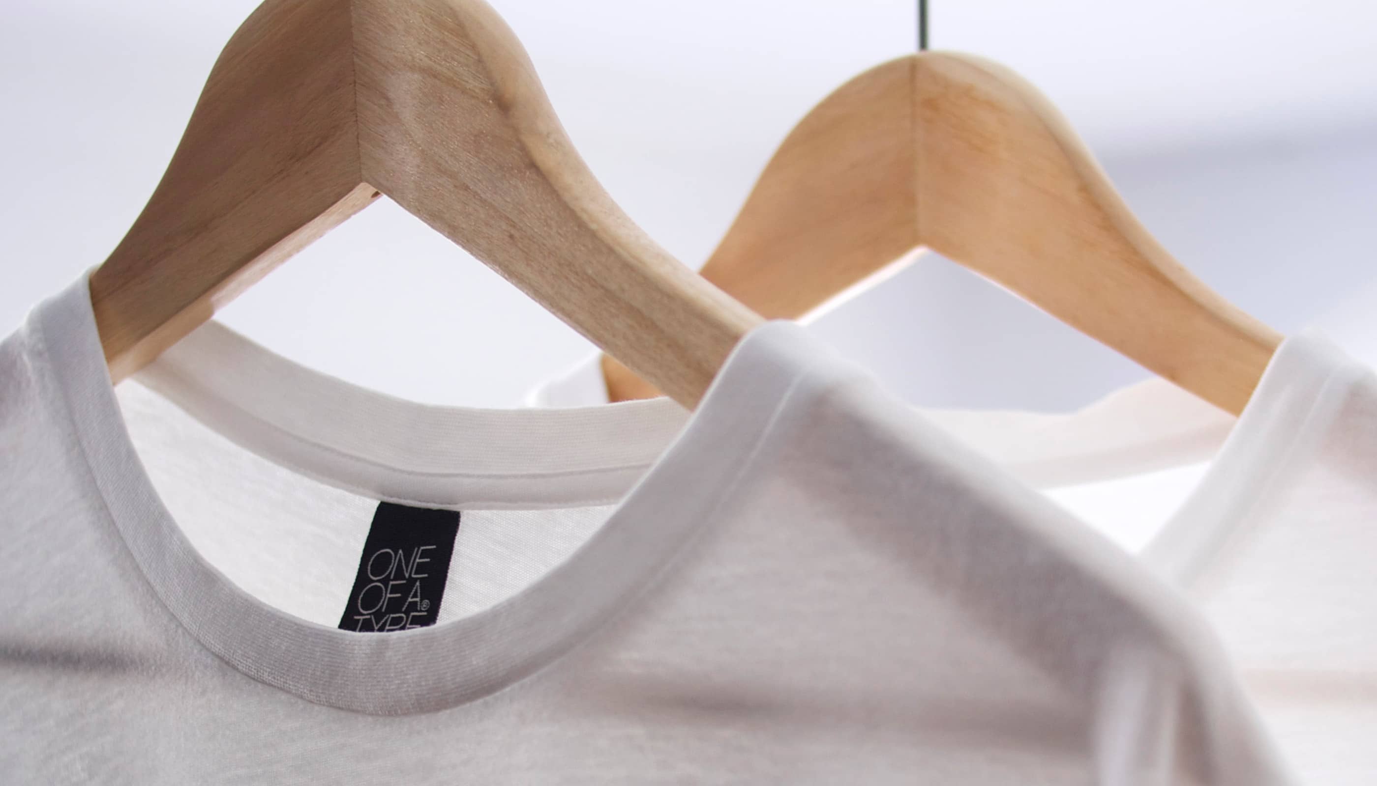
One of a Type was a personal project combining traditional printing techniques with modern design. Each piece was handcrafted using silkscreen printing and custom typography, produced in limited runs with individual edition numbers. The brand launched two collections, 50 Limited Edition and The Pocket Collection, each with its own visual identity built on the same brand foundation.
The design challenge was to create a system flexible enough to give each collection a distinct character while maintaining a coherent brand across all touchpoints, from the main logo to hang tags, packaging, and social media.
Introduction
One of a Type was a personal project combining traditional printing techniques with modern design. Each piece was handcrafted using silkscreen printing and custom typography, produced in limited runs with individual edition numbers. The brand launched two collections, 50 Limited Edition and The Pocket Collection, each with its own visual identity built on the same brand foundation.
The design challenge was to create a system flexible enough to give each collection a distinct character while maintaining a coherent brand across all touchpoints, from the main logo to hang tags, packaging, and social media.
Design Process
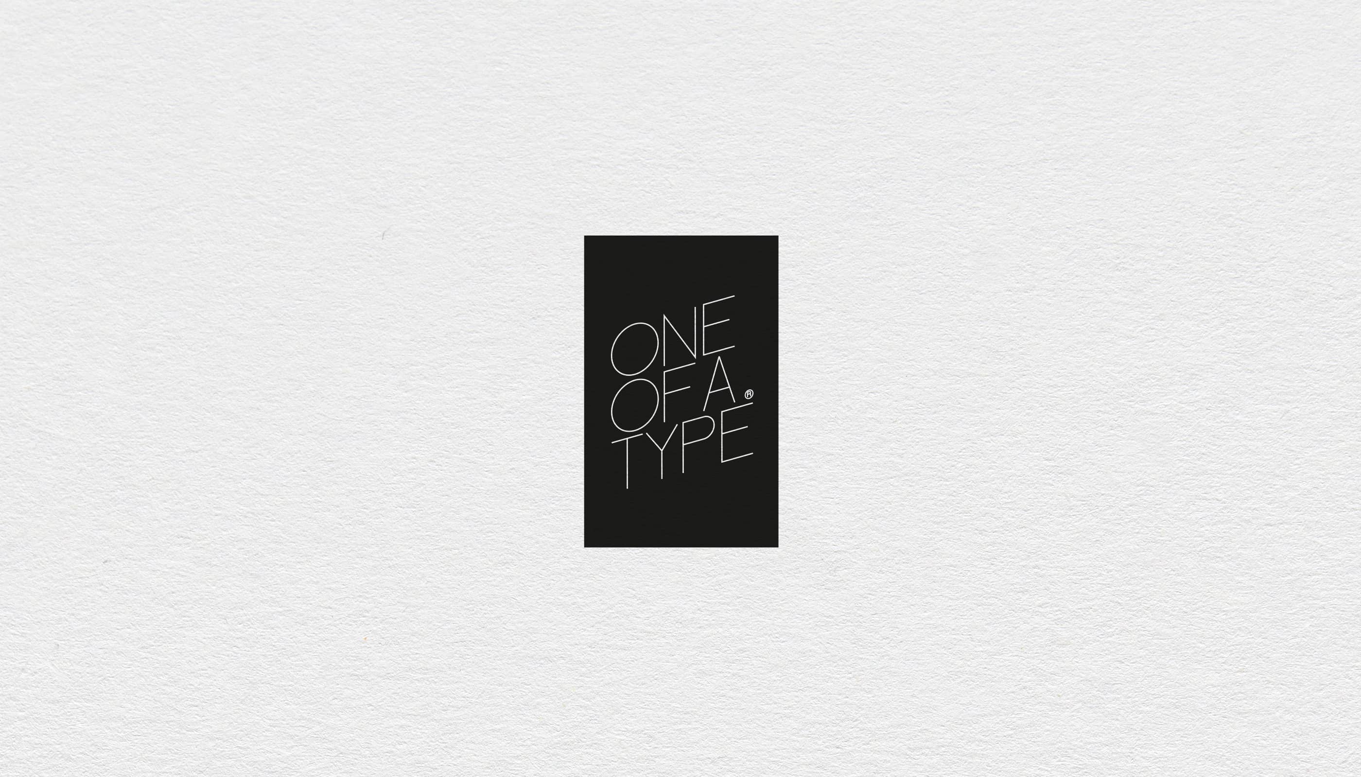
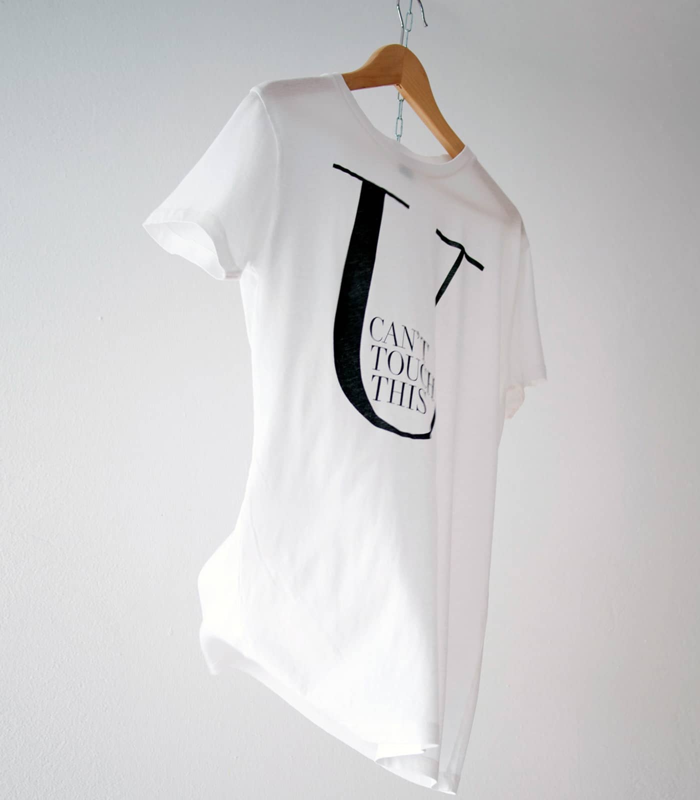
The system was built in two layers. The first was the main brand logo, a typographic mark designed for clarity and longevity. The letterforms were chosen for their precision and restraint, a visual language that reflects the care behind the physical production without competing with the texture of the printed pieces. All logos are black and white for the same reason: the identity steps back and lets the craft speak.
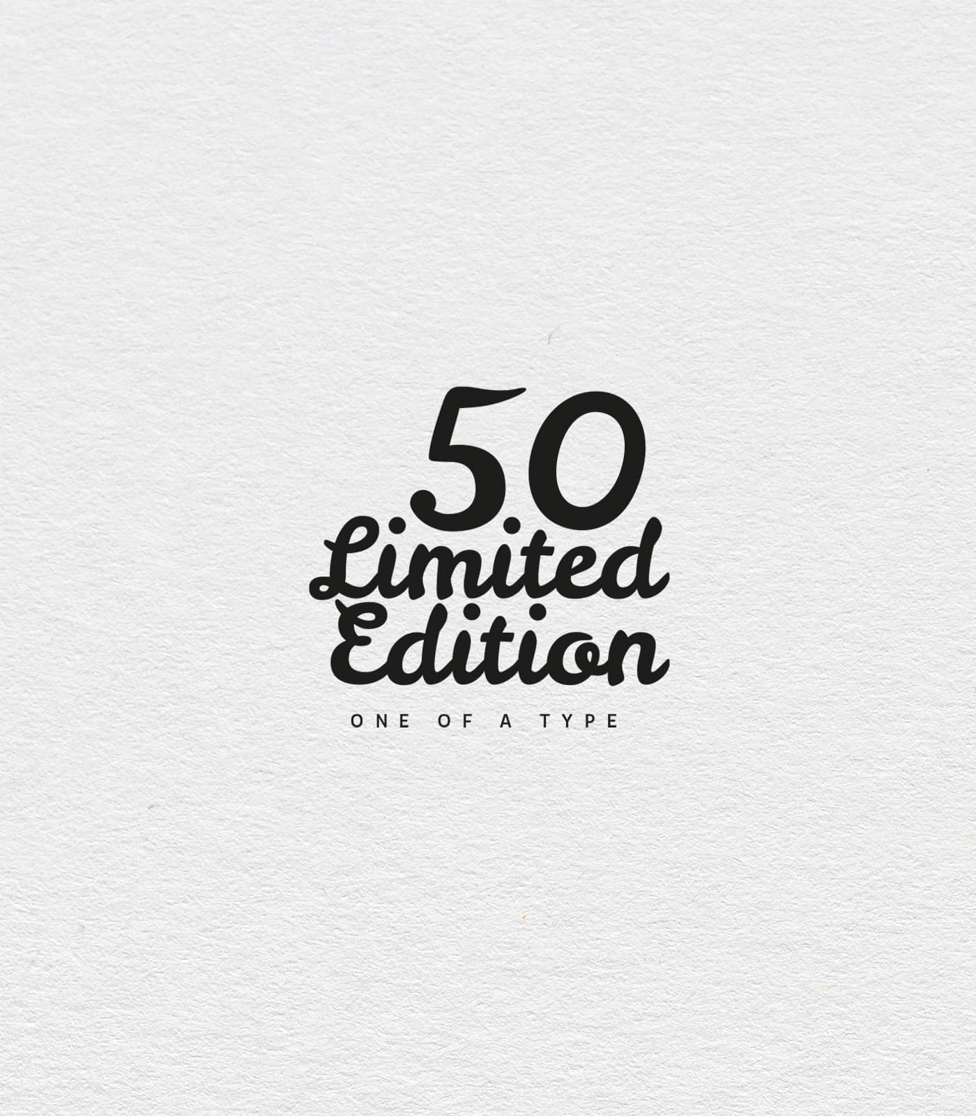
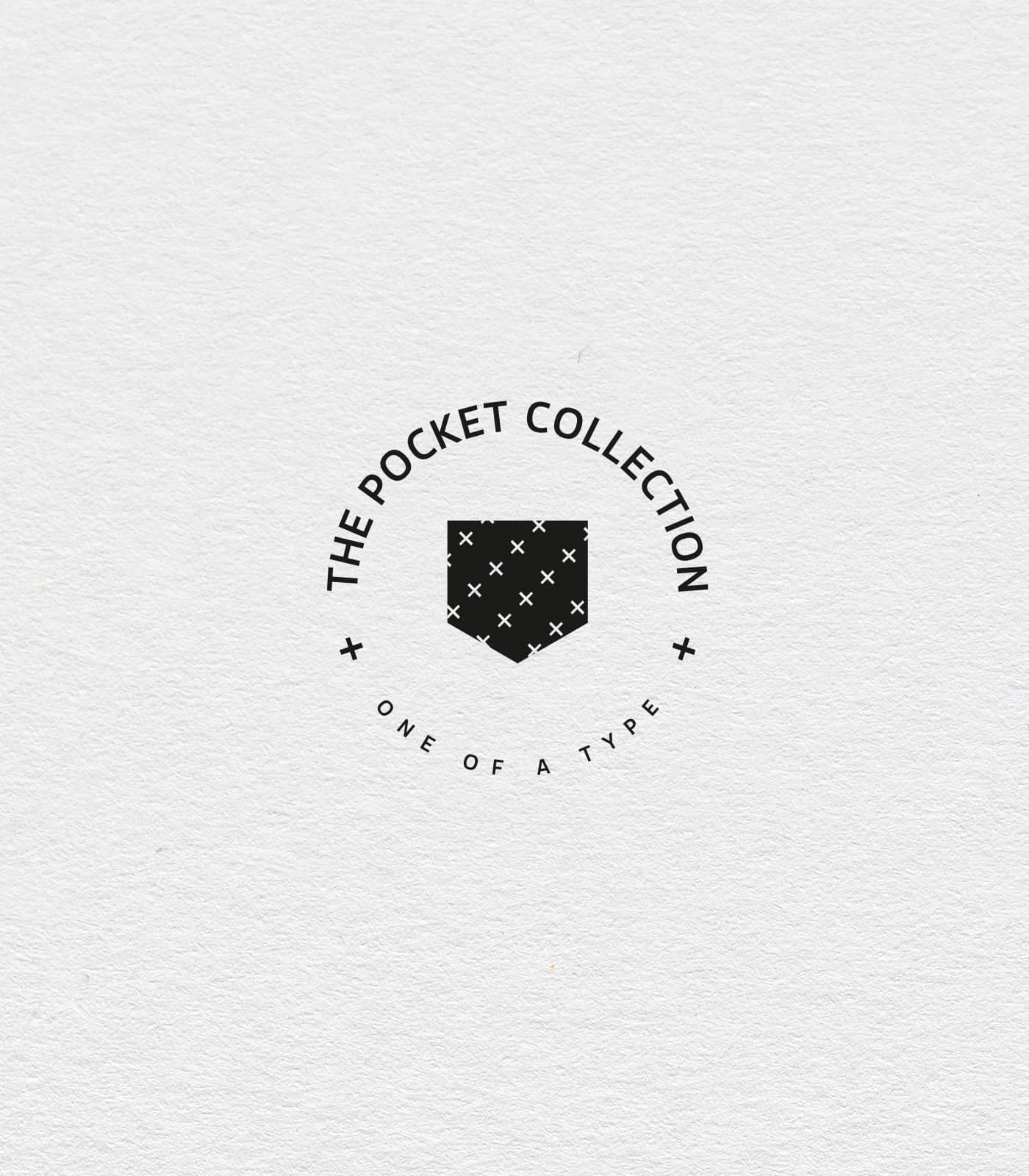
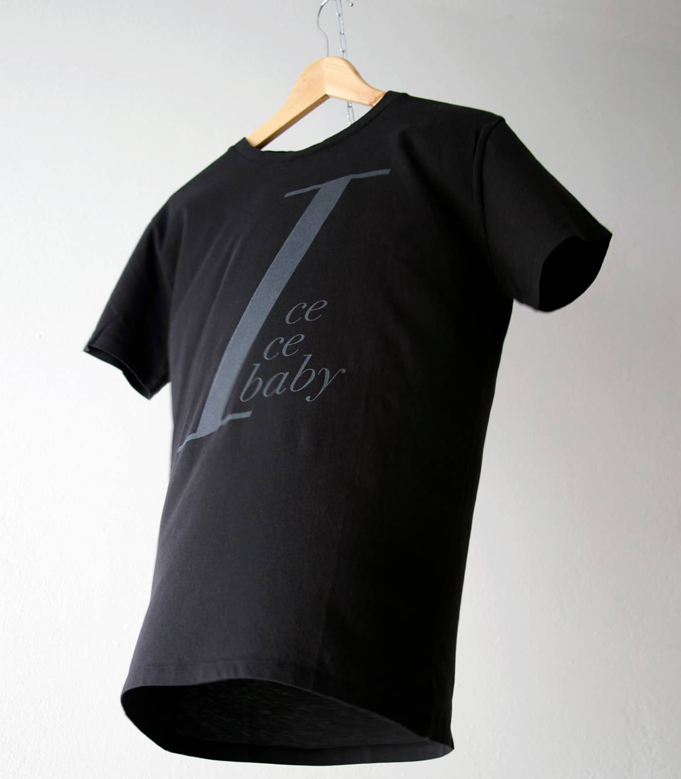
The second layer was the collection logos. Each one was developed independently, with its own typographic mood drawn from the theme of the collection. 50 Limited Edition uses a script and display combination that feels celebratory and tangible. The Pocket Collection uses a circular stamp format that references craft guild marks and artisanal production. The two logos are visually distinct but share the same black and white discipline and the same underlying logic.
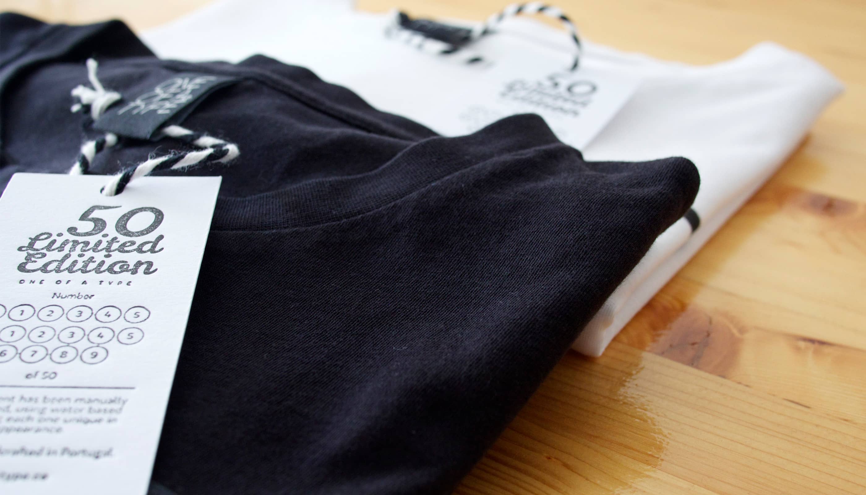
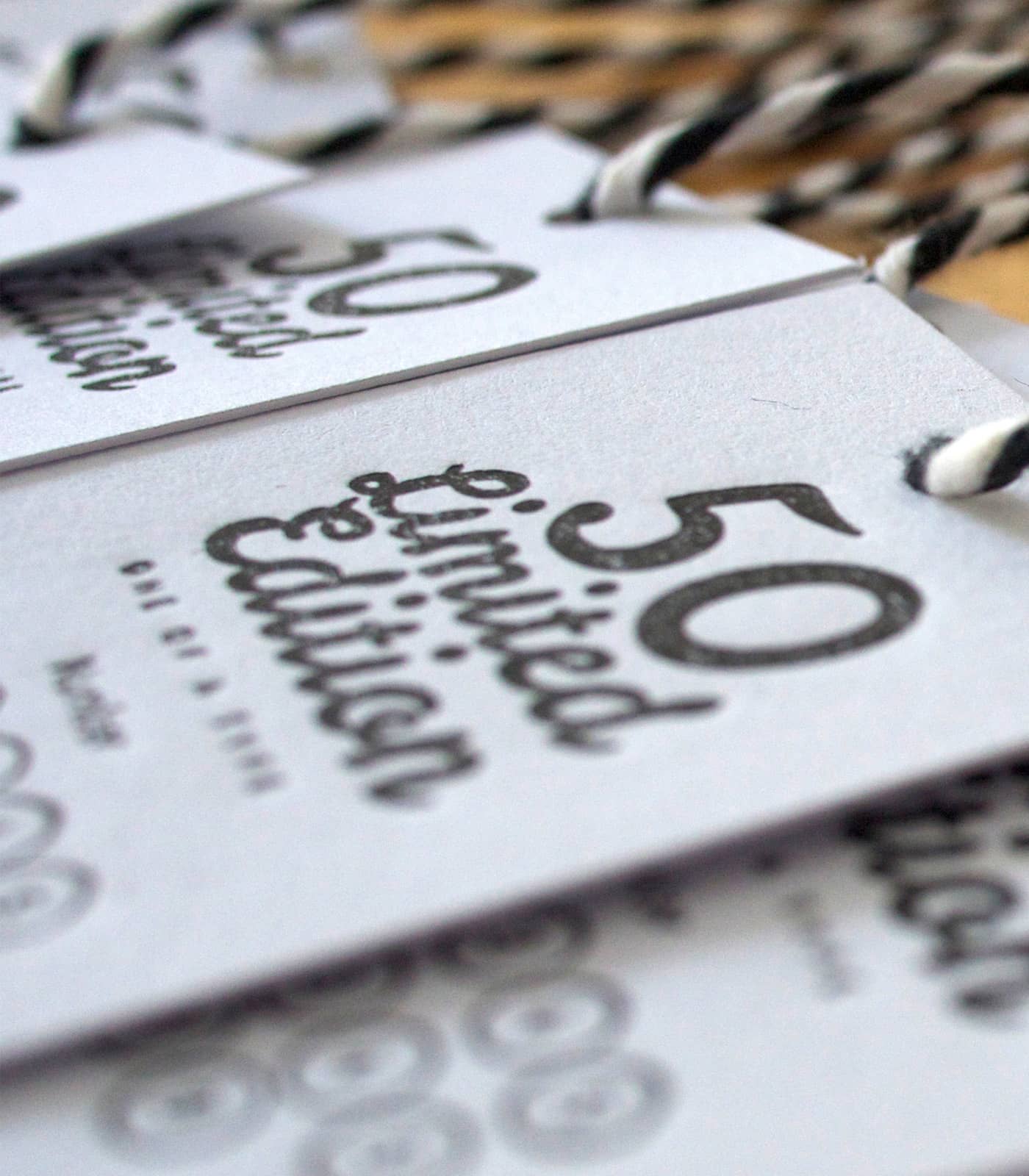
A numbering system was designed for the hang tags, marking each piece with its individual edition number out of the total run. This was a deliberate design decision: it transforms a product into a collectible and gives the buyer a direct connection to the limited nature of what they own.
Design Process
The system was built in two layers. The first was the main brand logo, a typographic mark designed for clarity and longevity. The letterforms were chosen for their precision and restraint, a visual language that reflects the care behind the physical production without competing with the texture of the printed pieces. All logos are black and white for the same reason: the identity steps back and lets the craft speak.
The second layer was the collection logos. Each one was developed independently, with its own typographic mood drawn from the theme of the collection. 50 Limited Edition uses a script and display combination that feels celebratory and tangible. The Pocket Collection uses a circular stamp format that references craft guild marks and artisanal production. The two logos are visually distinct but share the same black and white discipline and the same underlying logic.
A numbering system was designed for the hang tags, marking each piece with its individual edition number out of the total run. This was a deliberate design decision: it transforms a product into a collectible and gives the buyer a direct connection to the limited nature of what they own.
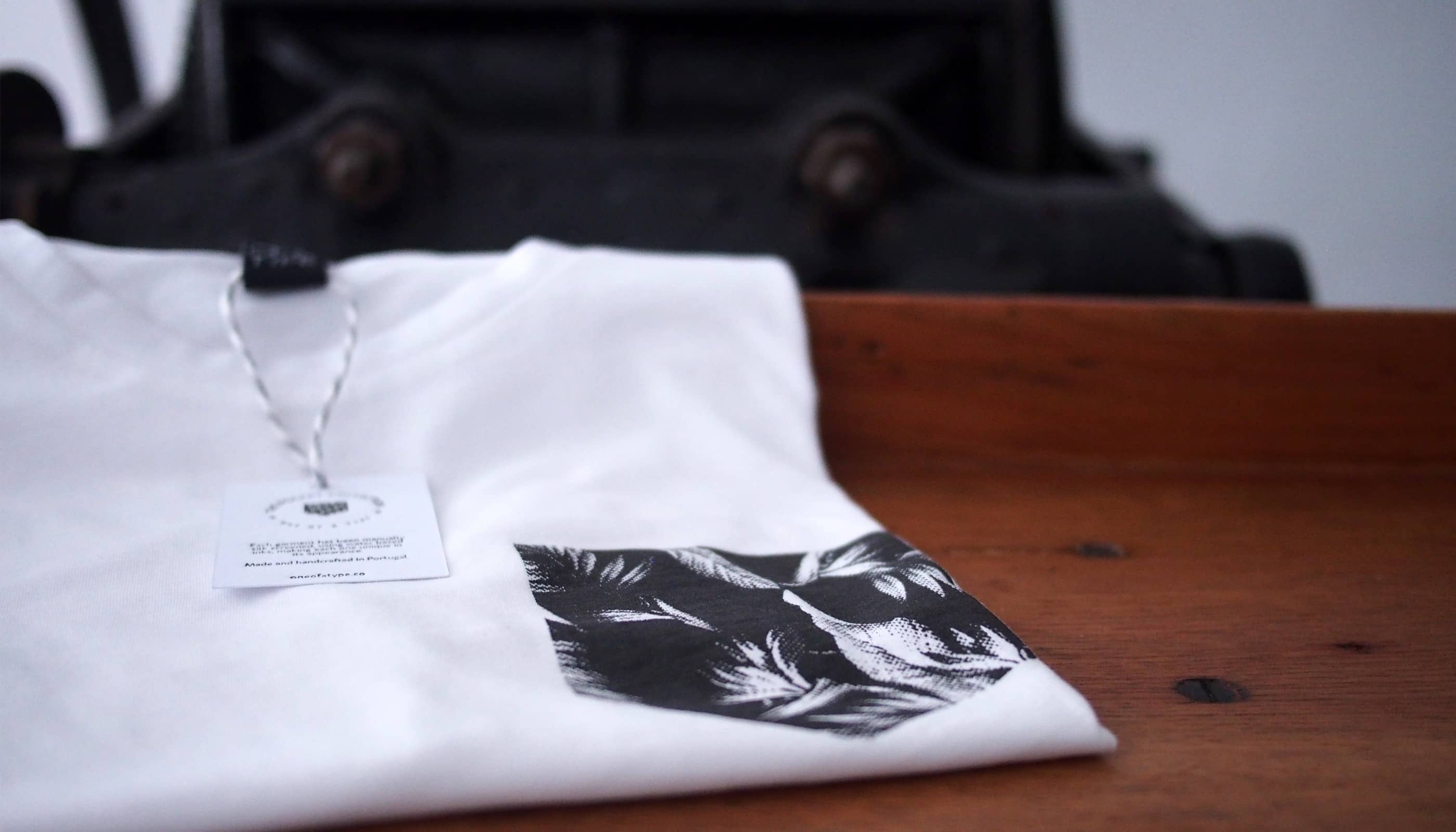
Applications
The identity was applied across every brand touchpoint: the main logo, collection-specific logos, product labels, hang tags with edition numbering, packaging, website, and social media. The photography used to present the brand was also directed and produced as part of the project, with a consistent aesthetic that carried the same restraint as the identity itself.
Design Process
The system was built in two layers. The first was the main brand logo, a typographic mark designed for clarity and longevity. The letterforms were chosen for their precision and restraint, a visual language that reflects the care behind the physical production without competing with the texture of the printed pieces. All logos are black and white for the same reason: the identity steps back and lets the craft speak.
The second layer was the collection logos. Each one was developed independently, with its own typographic mood drawn from the theme of the collection. 50 Limited Edition uses a script and display combination that feels celebratory and tangible. The Pocket Collection uses a circular stamp format that references craft guild marks and artisanal production. The two logos are visually distinct but share the same black and white discipline and the same underlying logic.
A numbering system was designed for the hang tags, marking each piece with its individual edition number out of the total run. This was a deliberate design decision: it transforms a product into a collectible and gives the buyer a direct connection to the limited nature of what they own.

Outcome
One of a Type launched and sold through social media and influencer partnerships, with both collections selling out their limited runs. The brand demonstrated that a clear, consistent identity system could carry across physical and digital touchpoints without losing coherence, and that collection-specific logos could create distinct moments within a single brand without fragmenting it.
The project remains a foundation of how I approach brand identity work: systems that are disciplined at the core and expressive at the edges.
WORK
Case Studies
Six case studies across crypto wallets, design systems, brand identity, and web products. The work ranges from feature UX to full brand restructures, with a consistent focus on clarity, scalability, and detail.


WORK
Case Studies
Six case studies across crypto wallets, design systems, brand identity, and web products. The work ranges from feature UX to full brand restructures, with a consistent focus on clarity, scalability, and detail.
WORK
Case Studies
Six case studies across crypto wallets, design systems, brand identity, and web products. The work ranges from feature UX to full brand restructures, with a consistent focus on clarity, scalability, and detail.
Thanks
Thanks for taking the time to look at my work.
© 2026 All rights reserved.
Thanks
Thanks for taking the time to look at my work.
© 2026 All rights reserved.
Thanks
Thanks for taking the time to look at my work.
© 2025 All rights reserved.